I've been looking into a way to visualize the quality of pedestrian mapping in OSM. Sure, there are already many "How Good Is OSM" maps out there, but I hadn't really done any GIS work in a little while so it was a good opportunity to stretch that muscle.
For the quality metric, I will consider the length of dedicated pedestrian infrastructure relative to the total length of road network. Consider these examples:
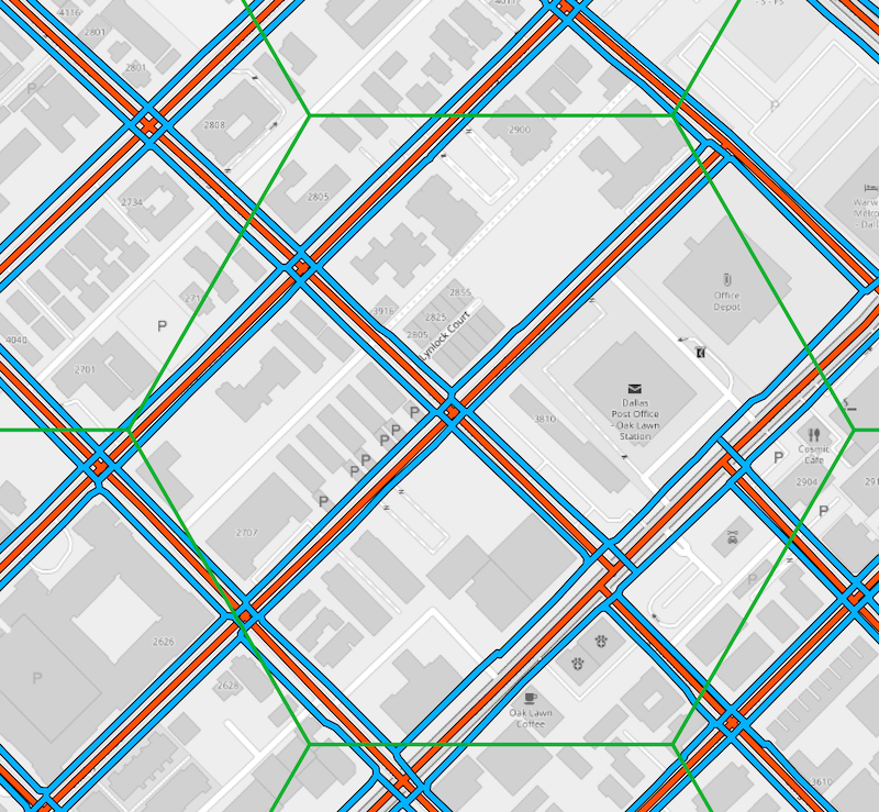
Pedestrian line features are styled blue, the road network in red. In this example, the length of the pedestrian line features exceeds the length of the road network. That would result in a "quality index" of >1.
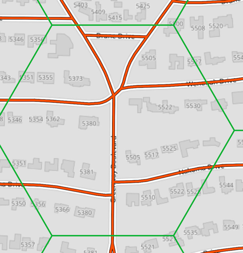
Considering the area below, we see no pedestrian line features at all, so our index would be 0.
The lowest quality index number would be 0, as in our second example above. There is no fixed upper bound, but realistically most cells would have a value between 0 and 2; 0 representing the lowest quality and 2 a very high quality.
This index could be refined in many ways. Some mappers prefer to add
sidewalk=*to the main road centerline as an attribute instead of drawing separate geometries. This style of mapping is not taken into account. Another way to improve our metric would be to include point features, such as crossings and pedestrian signals, into our analysis. I decided to keep it simple for this particular analysis.
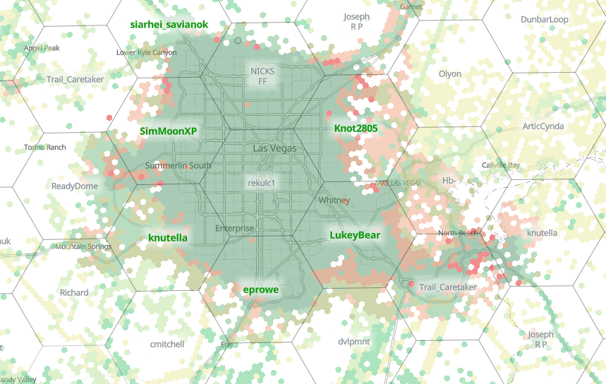
When choosing the unit of analysis, I was looking for a visually compelling result. While square cells would do just fins, I find hexbin maps like the ones you find on Kontur's disaster.ninja (see below) very aesthetically pleasing, so I thought I'd use the opportunity to try and make something like that. I decided on a cell size of 500 x 500 meters.
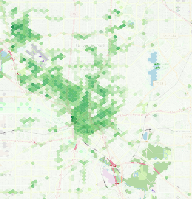
I looked at the H3 framework, but I wanted something that is a little lighter on the coding. QGIS has built-in support for creating various types of grids including hexagons, so that was the route I took. The entire process from downloading the OSM files to the end result is below, but if you just want to look at some pretty maps, here is one for the Boston area, and here is one for the Dallas / Fort Worth area. Making the web maps themselves was super easy: I used Felt, a new-ish "anyone can make a map" platform that lets you just drop any geospatial data file on the map and boom!
Tools needed #
The toolchain is entirely made up of open source tools:
osmiumto filter the OSM data files, get it hereosm2pgsqlto load OSM data into a PostGIS database, get it here- PostgreSQL + PostGIS, the database itself, I use Postgres.app on my Mac
- QGIS, the open source desktop GIS, get it here
If you have all the things, you can continue to downloading the data you need.
Download data from Geofabrik #
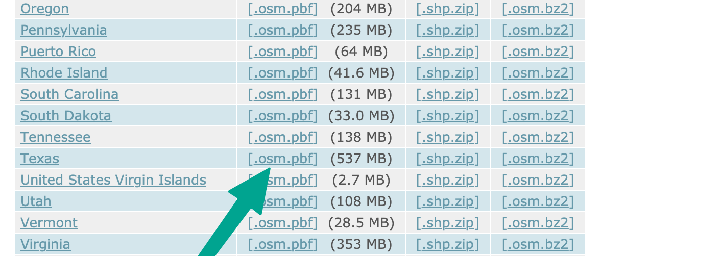
download.geofabrik.de has conveniently sized OSM data files for many countries and provinces / states. In this example I am going to create the Dallas / Fort Worth map, so I'll use the Texas .osm.pbf file.
Great. Let's filter this 0.5GB file to make it more manageable by removing a lot of features we don't need. osmium is a great and fast tool to do this. osm2pgsql has a more sophisticated way to define what OSM data ends up in your database and how (and I wrote a blog post covering that before) but sometimes it's just best to keep things simple.
Data preparation #
We use the osmium tags-filter subcommand to filter the OSM data. The full readme is here. It covers the peculiar filter syntax, and I encourage you to read it if you would like this tool yourself.
What I want for this analysis is two data files: one that has complete surface street network, and one that has just the pedestrian line features. for the first, I filter out anything but the nodes and ways that are highway=primary,secondary,tertiary,unclassified,residential,footway,path,cycleway. For the second, I filter out even more to just keep the highway=footway,path,cycleway, like so:
osmium tags-filter --overwrite -o tx-all.osm.pbf texas-latest.osm.pbf nw/highway=primary,secondary,tertiary,unclassified,residential,footway,path,cycleway
osmium tags-filter --overwrite -o tx-ped.osm.pbf texas-latest.osm.pbf nw/highway=footway,path,cycleway
The two output files will contain duplicate data, and there are definitely more thoughtful and / or sophisticated ways to do it, but this exercise was all about "getting it done". The discerning reader will encounter a few more, ahem, "shortcuts" along the way. I leave optimization as an exercise for the reader :)
Next up we'll to store the output files in separate PostGIS databases. Let's create them:
$ createdb tx-all && psql -d tx-all -c "create extension postgis"
$ createdb tx-ped && psql -d tx-ped -c "create extension postgis"
Using osm2pgsql, we load the filtered data into their respective databases:
osm2pgsql -c -d tx-all tx-all.osm.pbf
osm2pgsql -c -d tx-ped tx-ped.osm.pbf
With the data in place, we can move on to the fun stuff.
GIS work #
Let's boot up QGIS and create a new project. We'll set the project SRID to EPSG:3857 / Spherical Mercator. Using this SRID is useful in two ways: we can define the grid in meters, and we can load OSM raster background tiles in their native projection.
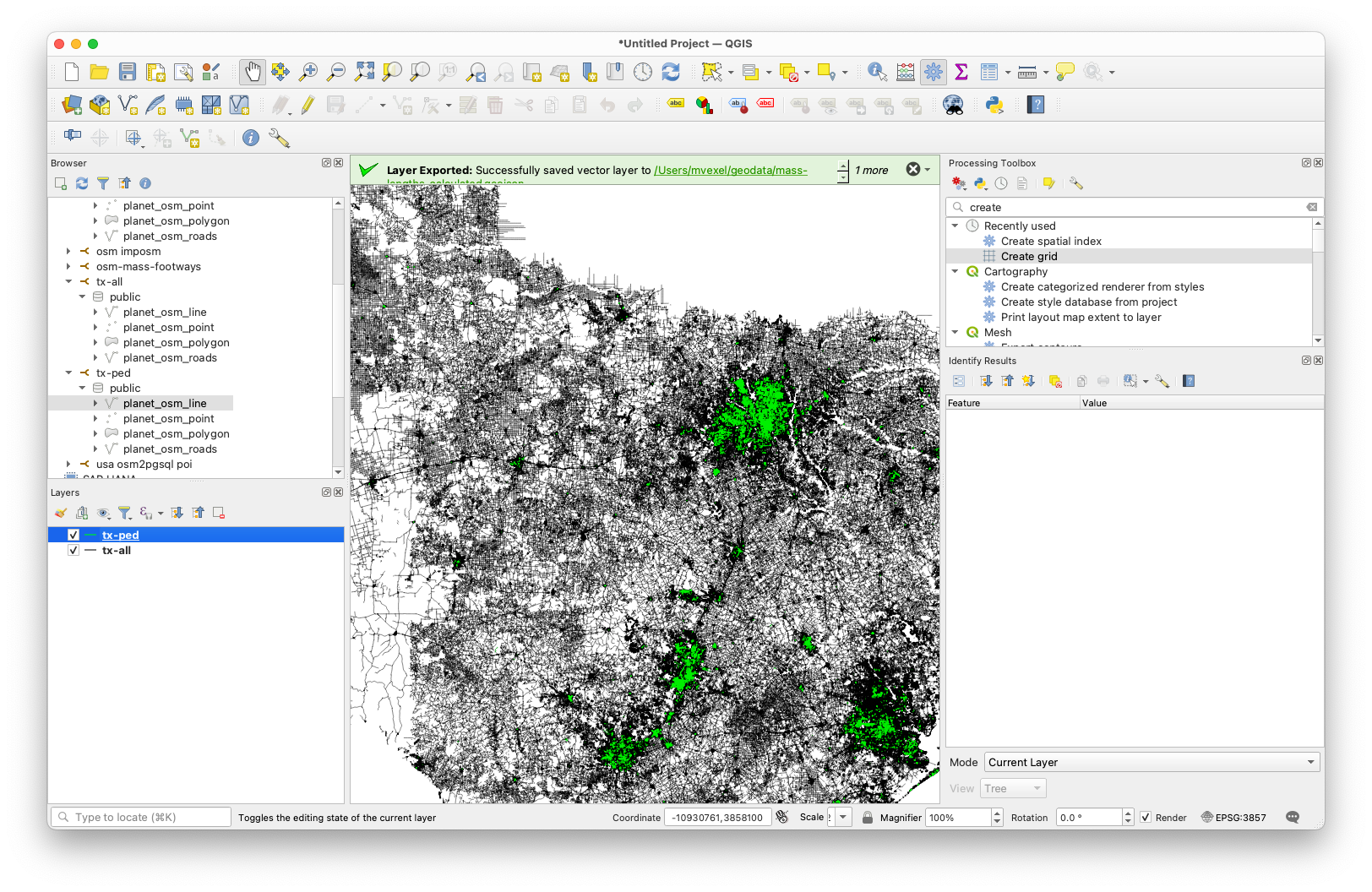
With the project initialized, we'll add the lines tables from both the all and ped databases. With a little bit of simple styling, we now have something like this:
 Next up is creating the hex grid. This turns out to be super easy. In the Processing Toolbox, select Create Grid and select Hexagon (Polygon) for the type. I chose 500x500 meters for the grid size (spacing). You can either calculate the grid extent from one of the data layers, but I chose to limit it a bit more by zooming and panning the map to the Dallas / Fort Worth area and using the current canvas extent as the grid extent.
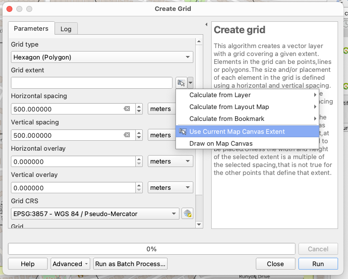
I chose to save the grid to a file I think I used a Geopackage, but anything that supports a spatial index would do.
We'll need to clip the OSM ways to the hex grid cells so we can create accurate aggregate metrics. For this, there is Processing Toolbox --> Split with Lines. We select the tx-all OSM roads as the input layer and the hexagon grid as the split layer:
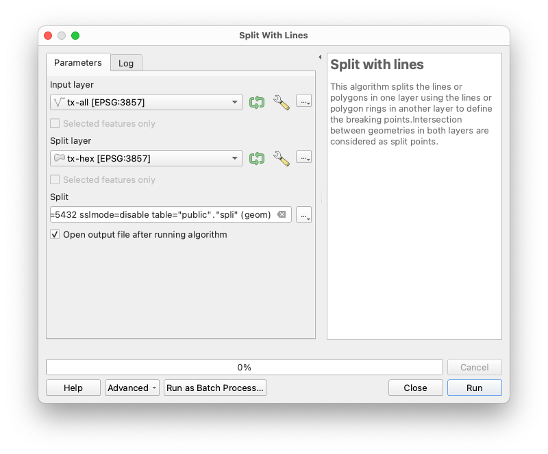 Again we save the result to permanent storage. In fact, in this case I saved it to a database table next to the unclipped features. You could use a file store too. Repeat this for the pedestrian ways layer.
This would be a good time to do some QGIS hygiene: Save your project; create layer groups; rename your layers so they make sense. As your project grows it's very easy to lose track of what layer was the result of what operation.
Because I saved the clipped features in a PostGIS table, I wanted to make sure the tables had a spatial index on them. I tried and tried but could not get this to work in QGIS, so I resorted to the command line to add indices to the clipped feature tables..
psql -d tx-all -c "create index idx_split on spli using gist(geom)"
psql -d tx-ped -c "create index idx_split on spli using gist(geom)"
I don't know why my tables ended up being named spli.
Anyway, time to start generating some aggregate statistics on the line lengths of both layers for each grid cell. For that, QGIS has Processing toolbox --> Sum Line Lengths. For the polygons, we use the hex grid, and for the lines, the OSM roads / ped network, respectively:
 I usually don't use QGIS temporary layers, because QGIS has a tendency to crash on me and lose my layers. But in this case I guess I did!
The two aggregate statistics operations result in two separate hex grid layers. Each grid cell was assigned a unique fid, so we can simply Processing Toolbox --> Join Attributes by field value using the fid field value to have all the line lengths in one grid layer. We only need the LENGTH field from the other grid layer. To tell the lengths apart, we use the prefix PED_ like this:
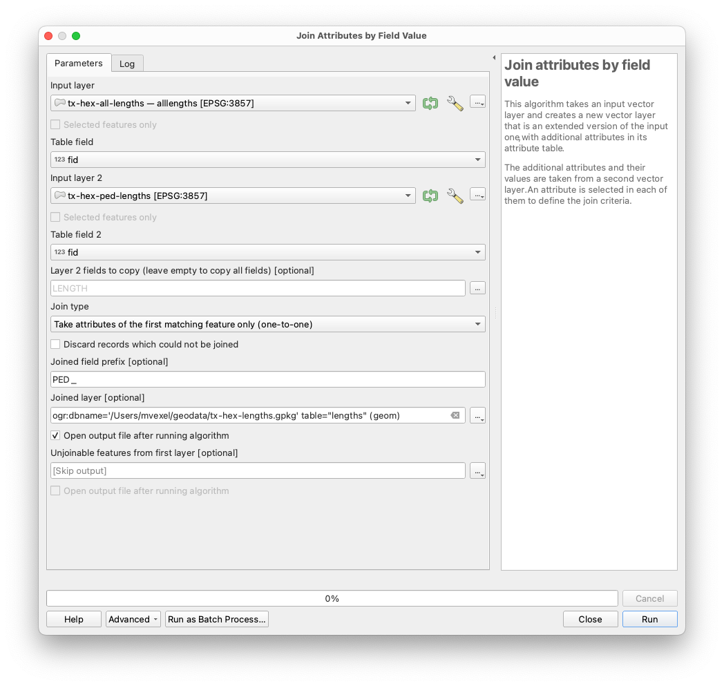
I saved this as another PostGIS table and then discarded the temporary layers.
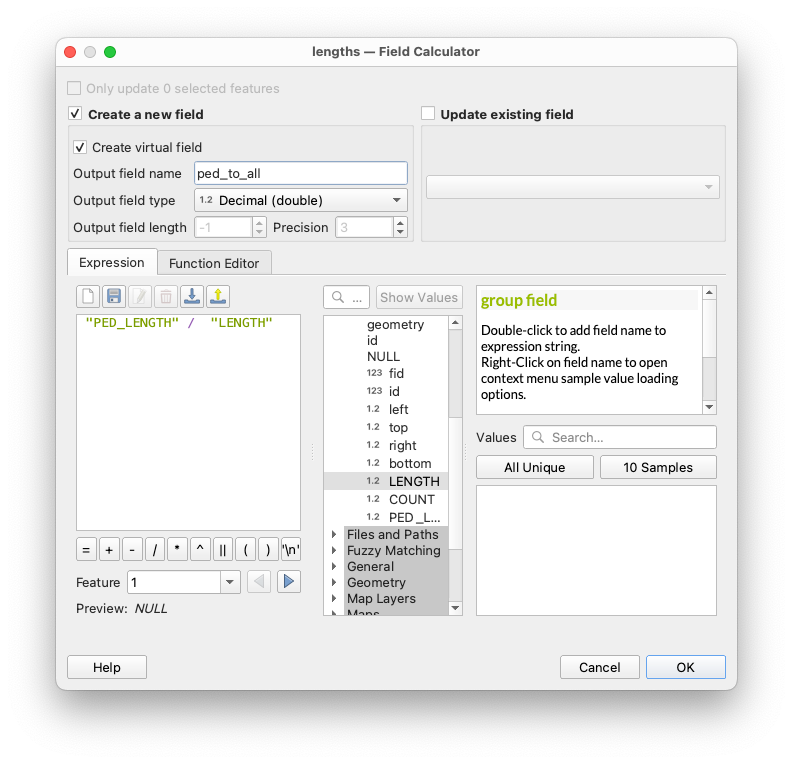
We're almost there. The final step of the analysis is to calculate the ratio
pedestrian line length / road network line length
This should be an okay proxy for pedestrian map quality.
Let's use the field calculator to create a new field with this number:
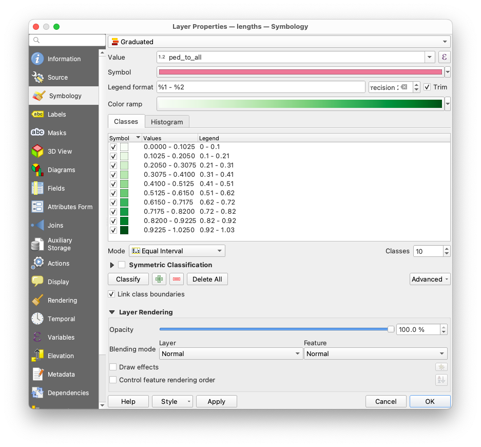
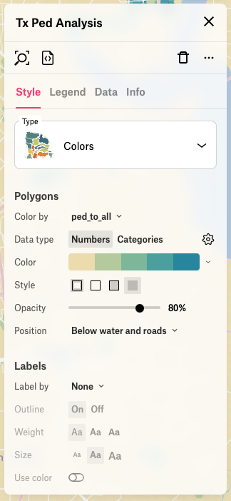
 Optionally, you can add some styling to the resulting layer to inspect the result:
With the analysis done, all that's left now is exporting the grid as a GeoJSON file we can drop in Felt. To reduce the file size, let's remove some attributes we won't be using:
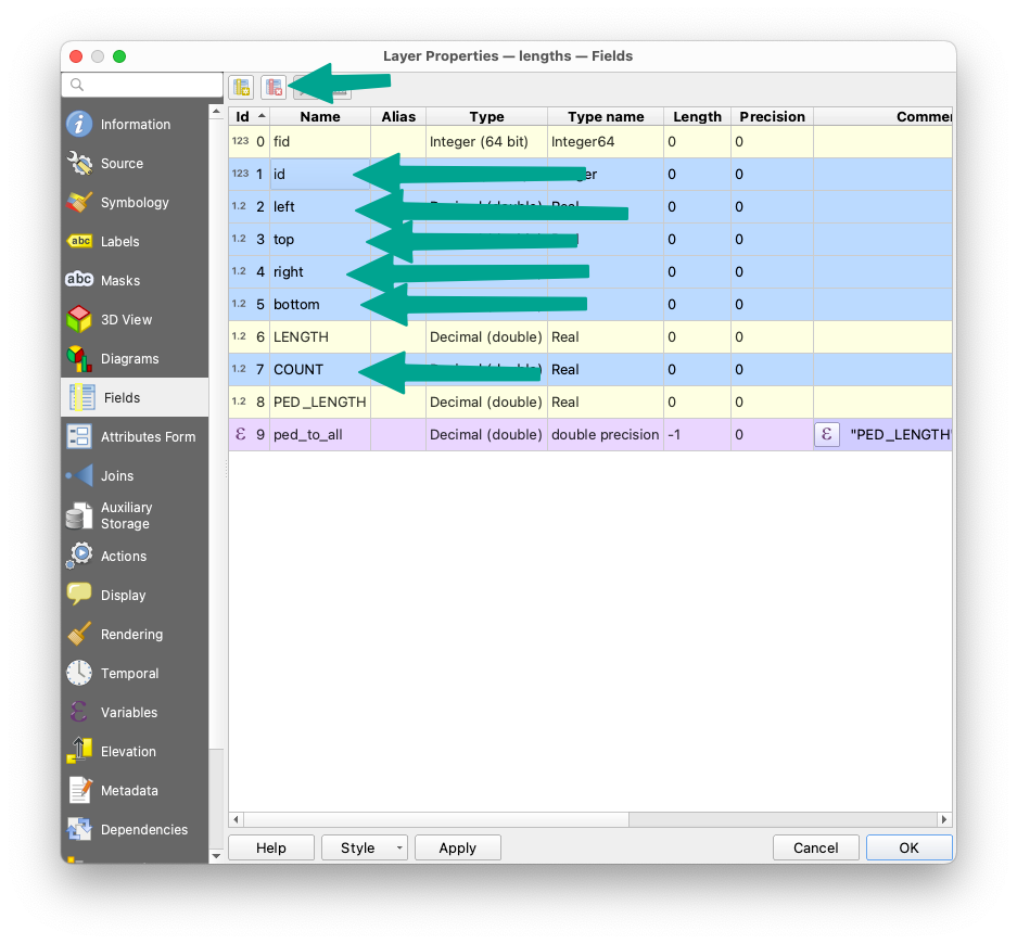 When exporting, pay attention to to some of the defaults, especially the ridiculous default 15 decimal position coordinate precision:

Create pretty display map #
In Felt, create a new map and drop the GeoJSON file onto it. Then apply some styling:
Looking pretty nice!
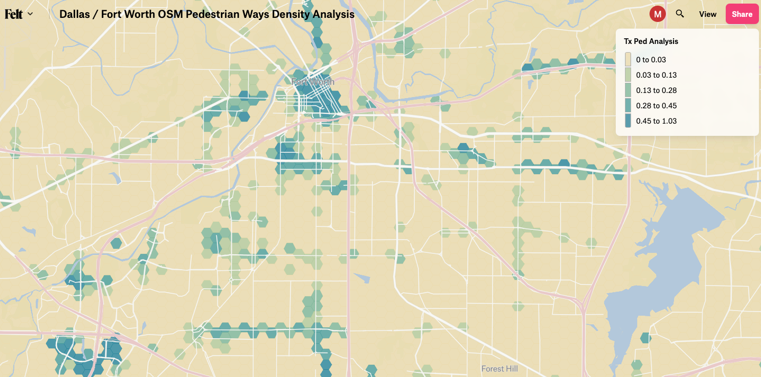
You can see the result maps here (Boston area), and here (Dallas / Fort Worth area).
Thanks for reading! Drop me a line to collaborate on fun GIS projects or ask any questions about this analysis.